 Psst! Do you accept cookies?
The CSS grid is a newer standard that makes it easy to build complex responsive layouts. It works by turning an HTML element into a grid, and lets you place child elements anywhere within.
Life was tough before Flexbox and Grid came, centering a div was so troublesome that it became a meme.

But fear no more, Flexbox and Grid have solved all our problems and things are so much easier now.
In my last blog I discussed the Flex Layout:

Complete Introduction to CSS Flexbox 💪
KUMAR HARSH ・ Jul 25 ・ 9 min read
#css #beginners #webdev #productivityIn this blog, we'll learn the fundamentals of CSS grid by building different complex layouts.
Grid is used for making complex web design layouts more easily as it's not so hard to master.
Using Flexbox you can make only a 1D layout but Grid gives you the full power of creating a 2D layout.
If you want to know more about the differences between Flexbox and Grid, you can read this article.
 Chris Coyier
@chriscoyier
Chris Coyier
@chriscoyier
 For y'all that have an understand of both CSS grid and flexbox, what's your favorite way of explaining the difference?
15:53 PM - 25 Jan 2019
For y'all that have an understand of both CSS grid and flexbox, what's your favorite way of explaining the difference?
15:53 PM - 25 Jan 2019


 Brian Haferkamp
@brianhaferkamp
@chriscoyier How about this:
Brian Haferkamp
@brianhaferkamp
@chriscoyier How about this:#Flexbox is for alignment. #CSSGrid is for layout.
This is almost always how I wind up using them. It allows them to preserve their relationships to one another. It also allows each to be used for its strength, even though each can do the other thing. 21:20 PM - 25 Jan 2019
Let's start
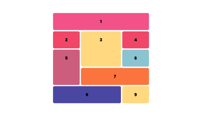
📌 Create Your First CSS Grid
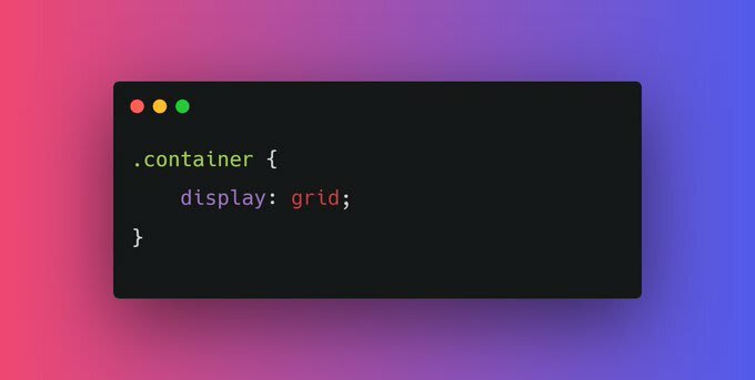
Turn any HTML element into a grid container by setting its display property to grid. This gives you the ability to use all the other properties associated with CSS Grid.
Note: In CSS Grid, the parent element is referred to as the container, and its children are called items.
Nothing will change after adding display: grid; in the parent container because we need to define the width of columns. In order to set that column's width, we have gird-template-columns property.
📌 Add Columns with grid-template-columns
Simply creating a grid element doesn't get you very far. You need to define the structure of the grid as well. To add some columns to the grid, use the grid-template-columns property on a grid container as demonstrated below:
.container {
  display: grid;
  grid-template-columns: 50px 50px;
}
This will give your grid two columns that are each 50px wide.
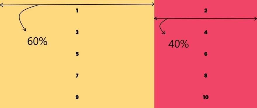
For more examples, let's say I need two columns of width 60% and 40% respectively.
.container {
display: grid;
grid-template-columns: 60% 40%;
}
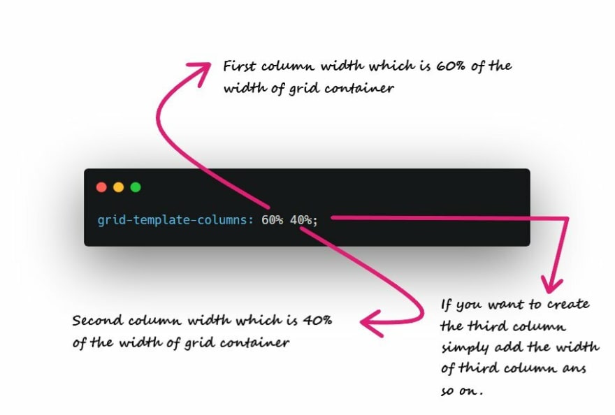
The number of parameters given to the grid-template-columns property indicates the number of columns in the grid, and the value of each parameter indicates the width of each column.
Here is an example with the Code:
📌 Add Rows with grid-template-rows
The grid you created in the last challenge will set the number of rows automatically. To adjust the rows manually, use the grid-template-rows property in the same way you used grid-template-columns in the previous challenge.
For Example:
grid-template-rows: 200px 400px;


Here is an example with the Code:
📌 Use CSS Grid units to Change the Size of Columns and Rows
You can use absolute and relative units like px and em in CSS Grid to define the size of rows and columns.
You can use these as well:
fr: sets the column or row to a fraction of the available space,auto: sets the column or row to the width or height of its content automatically,%: adjusts the column or row to the percent width of its container
For Example:
grid-template-columns: auto 50px 10% 2fr 1fr;
This snippet creates five columns. The first column is as wide as its content, the second column is 50px, the third column is 10% of its container, and for the last two columns; the remaining space is divided into three sections, two are allocated for the fourth column, and one for the fifth.
We might run into some responsiveness issues if we pass pixel unit or percentage in our grid-template-columns.
In order to prevent this, it is recommended to use fraction values
For example:


Here is an example with the Code:
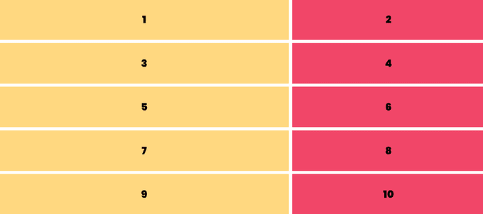
📌 Create a Column Gap Using grid-column-gap
If you're thinking, Ahh!! My grid items look ugly as there is no spacing between them.
Here grid-column-gap property comes into play.
So far in the grids, we have created, the columns have all been tight up against each other. Sometimes you want a gap in between the columns.
To add a gap between the columns, use the grid-column-gap property like this:
grid-column-gap: 10px;
This creates 10px of empty space between all of our columns.
Here is an example with the Code:
📌 Create a Row Gap using grid-row-gap
You can add a gap in between the rows of a grid using grid-row-gap in the same way that you added a gap in between columns in the previous section.
grid-row-gap: 10px;
This creates 10px of empty space between all of our rows.
Here is an example with the Code:
📌 Add Gaps Faster with grid-gap
grid-gap is a shorthand property for grid-row-gap and grid-column-gap from the previous two sections that's more convenient to use.
If the grid-gap has one value, it will create a gap between all rows and columns. However, if there are two values, it will use the first one to set the gap between the rows and the second value for the columns.
For example, If I need 10px spacing along column and row
grid-gap: 10px;
But if we need separate spacing between rows and columns:
grid-gap: 10px 20px;
This creates 10px of empty space between all of our rows and 20px of empty space between our columns.
Here is an example with the Code:
🤔 Well all that we have covered so far we can do that using flexbox also.
Let's understand the 2 dimensions of grid layout 👇
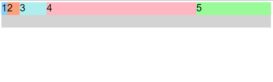
📌 Use grid-column to Control Spacing
Up to this point, all the properties that have been discussed are for grid containers. The grid-column property is the first one for use on the grid items themselves.
The hypothetical horizontal and vertical lines that create the grid are referred to as lines. These lines are numbered starting with 1 at the top left corner of the grid and move right for columns and down for rows, counting upward.

To control the number of columns an item will consume, you can use the grid-column property in conjunction with the line numbers you want the item to start and stop at.
Here's an example:
grid-column: 1 / 3;
This will make the item start at the first vertical line of the grid on the left and span to the 3rd line of the grid, consuming two columns.
For example, If I want my first item to take up an entire row, that is from the first column to the last column.
grid-column: 1 / 4;

Here is an example with the Code:
📌 Use grid-row to Control Spacing
Of course, you can also make items consume multiple rows just like you can with columns. You define the horizontal lines you want an item to start and stop at using the grid-row property on a grid item.
Here is an example with the Code:
📌 Align an Item Horizontally using justify-self
In CSS Grid, the content of each item is located in a box which is referred to as a cell. You can align the content's position within its cell horizontally using the justify-self property on a grid item.
By default, this property has a value of stretch, which will make the content fill the whole width of the cell. This CSS Grid property accepts other values as well:
start: aligns the content at the left of the cell,center: aligns the content in the center of the cell,end: aligns the content at the right of the cell.
Here is an example with the Code:
📌 Align an Item Vertically using align-self
Just as we can align an item horizontally, there's a way to align an item vertically as well. To do this, we use the align-self property on an item. This property accepts all of the same values as justify-self from the last section, i.e. stretch by default and other options being center, end, and start.
Here is an example with the Code:
📌 Align All Items Horizontally using justify-items
Sometimes you want all the items in your CSS Grid to share the same alignment. We can use the previously learned properties and align them individually, or we can align them all at once horizontally by using justify-items on our grid container.
This property can accept all the same values we have learned about in the previous two sections, the difference being that it will move all the items in our grid to the desired alignment.
Here is an example with the Code:
📌 Align All Items Vertically using align-items
Using the align-items property on a grid container will set the vertical alignment for all the items in our grid.
Here is an example with the Code:
📌 Divide the Grid Into an Area Template
We can group cells of our grid together into an area and give the area a custom name. Do this by using grid-template-areas on the container like this:
grid-template-areas:
  "header header header"
  "advert content content"
  "footer footer footer";
The code above merges the top three cells together into an area named header, the bottom three cells into a footer area, and it makes two areas in the middle row; advert and content.
🎯 Note: Every word in the code represents a cell and every pair of quotation marks represents a row. In addition to custom labels, you can use a period (.) to designate an empty cell in the grid.
Here is an example with the Code:
📌 Place Items in Grid Areas Using the grid-area Property
After creating an area template for our grid container, as shown in the previous section, we can place an item in our custom area by referencing the name we gave it.
To do this, we use the grid-area property on an item like this:
.item1 {
  grid-area: header;
}
This lets the grid know that we want the item1 class to go in the area named header. In this case, the item will use the entire top row because that whole row is named as the header area.
Let's see another example:

Now let's apply this area (areaName) to the first grid item
.one {
    grid-area: areaName;
}
As you can see item1 takes one entire row and 5 columns. As simple as that 🙌.

Here is an example with the Code:
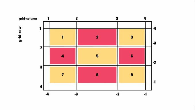
📌 Use grid-area Without Creating an Areas Template
The grid-area property we learned in the last challenge can be used in another way. If your grid doesn't have an areas template to reference, you can create an area on the fly for an item to be placed like this:
item1 {
grid-area: 1/1/2/4;
}
This is using the line numbers we learned about earlier to define where the area for this item will be. The numbers in the example above represent these values:
grid-area: horizontal line to start at / vertical line to start at / horizontal line to end at / vertical line to end at;
So the item in the example will consume the rows between lines 1 and 2, and the columns between lines 1 and 4.
Here is an example with the Code:
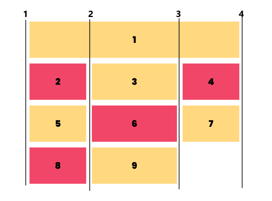
📌 Reduce Repetition Using the repeat Function
When we used grid-template-columns and grid-template-rows to define the structure of a grid, we entered a value for each row or column we created.
Let's say we want a grid with 100 rows of the same height. It isn't very practical to insert 100 values individually. Fortunately, there's a better way - by using the repeat function to specify the number of times we want our column or row to be repeated, followed by a comma and the value we want to repeat.
Here's an example that would create the 100-row grid, each row at 50px tall.
grid-template-rows: repeat(100, 50px);
We can also repeat multiple values with the repeat function and insert the function amongst other values when defining a grid structure. Here's what that looks like:
grid-template-columns: repeat(2, 1fr 50px) 20px;
Note: The 1fr 50px is repeated twice followed by 20px.
This translates to:
grid-template-columns: 1fr 50px 1fr 50px 20px;
Here is an image to help you understand better:

Here is an example with the Code:
📌 Limit Item Size Using the minmax Function
There's another built-in function to use with grid-template-columns and grid-template-rows called minmax. It's used to limit the size of items when the grid container changes size.
To do this we need to specify the acceptable size range for our item. Here is an example:
grid-template-columns: 100px minmax(50px, 200px);
In the code above, grid-template-columns are set to create two columns; the first is 100px wide, and the second has the minimum width of 50px and the maximum width of 200px.
Here is an example with the Code:
📌 Create Flexible Layouts Using auto-fill
The repeat function comes with an option called auto-fill. This allows you to automatically insert as many rows or columns of your desired size as possible depending on the size of the container.
You can create flexible layouts when combining auto-fill with minmax, like this:
repeat(auto-fill, minmax(60px, 1fr));
When the container changes size, this setup keeps inserting 60px columns and stretching them until it can insert another one.
🎯 Note: If your container can't fit all your items on one row, it will move them down to a new one.
Here is an example with the Code:
📌 Create Flexible Layouts Using auto-fit
auto-fit works almost identically to auto-fill. The only difference is that when the container's size exceeds the size of all the items combined, auto-fill keeps inserting empty rows or columns and pushes your items to the side, while auto-fit collapses those empty rows or columns and stretches your items to fit the size of the container.
Note: If your container can't fit all your items on one row, it will move them down to a new one.
Here is an example with the Code:
📌 grid-auto-rows + grid-auto-columns
grid-auto-rows and grid-auto-columns specify the sizing for grid tracks that are generated automatically. The properties come in really handy when you want to be able to add items that will spill onto new rows/columns, but want to retain some control over the sizing of the implicitly created rows/columns.
Both properties default to a value of auto and they are defined on the grid container (the element with display: grid).
For example:
grid-auto-rows: 200px;

Though there is a problem. By doing this, we are setting the fixed height so content inside items can be overflow.

In order to prevent this kind of issue we have a minmax function
grid-auto-rows: minmax(200px, auto);
It's pretty intuitive that the height of gird items will be 200px minimum and auto maximum (according to content).

📌 Use Media Queries to Create Responsive Layouts
This isn't any property of Grid, but we'll see how we can use different properties for different screen widths to get our desired layout.
CSS Grid can be an easy way to make your site more responsive by using media queries to rearrange grid areas, change the dimensions of a grid, and rearrange the placement of items.
In the example, when the viewport width is 300px or more, the number of columns changes from 1 to 2. The advertisement area then occupies the left column completely.
When the viewport width is 400px or more, we'll make the header area occupy the top row completely and the footer area occupies the bottom row completely.
Here is the code:
📌 Create Grids within Grids
Turning an element into a grid only affects the behavior of its direct descendants. So by turning a direct descendant into a grid, you have a grid within a grid.
For example, by setting the display and grid-template-columns properties of the element with the item3 class, you create a grid within your grid.
Here is an example with the Code:
🎯 Bonus
Grid Garden
A game designed to test your grid layout skills, you can practice here to solidify your learning.CSS Grid
A course designed by Wes Bos, with many projects to help understand Grid better.
That's all for today!
It was a long post so I might have made some mistakes or typos so please let me know if you find one so I can correct it.
If you liked my content consider following me on Twitter.
Also if you got any questions feel free to ping me on Twitter.
What's your thoughts?
Please Register or Login to your account to be able to submit your comment.